Six-E

SIX-E is a start-up aiming to launch an AI-based solution designed to support small and medium-sized businesses in creating and managing their digital campaigns. This solution is tailored for non-expert users who want to position their company in the digital market as effectively as possible, with minimal effort.
At the start of our collaboration, the client was developing a landing page and an initial Proof of Concept (PoC) to test the AI-driven campaign and advertisement creation algorithm. Our goal was to enhance the brand identity and the service’s unique value proposition. Starting from the client’s initial PoC, we redesigned the key features, making them more intuitive and efficient for users, in order to develop a first MVP and attract new investors.


From the analysis of the existing product to the development of the MVP's UX/UI strategy.
Through collaboration with the client I gained a deeper understanding of the product, evaluating its touchpoints, target audience, and the startup's vision. I identified key issues:
- The landing page failed to convey the service's value or convert leads into prospects.
- Post-login navigation was unclear, leaving users confused about what to do.
- Campaign creation was too technical and not intuitive.
- Users sought more insightful performance data for campaigns and ads.
I conducted a benchmark of similar products (e.g., Google Ads, Grammarly) and proposed low-fidelity wireframes and AI-based solutions, collecting feedback for further refinement.


The client’s original brand identity, with colors, fonts, and logo, remained the same. However, we revised the UI, which had moved away from the brand's guidelines. To solve storytelling challenges, we reorganized the page sections for better clarity and distinction. Additionally, we developed six illustrations symbolizing the "6 Es," a defining feature of the product, and integrated them into the landing page to present the service’s features
A new navigation model to improve the product usability
After logging in, users struggled to navigate and find key actions. I addressed this by creating a scalable navigation model.
- A primary left-hand navigation bar provides access to main sections like profile and the campaign dashboard.
- The right-hand window displays content and relevant CTAs for the chosen section.
- Modals handle secondary sections such as profile, settings, and payment methods.
- Empty states guide users intuitively through unpopulated sections.


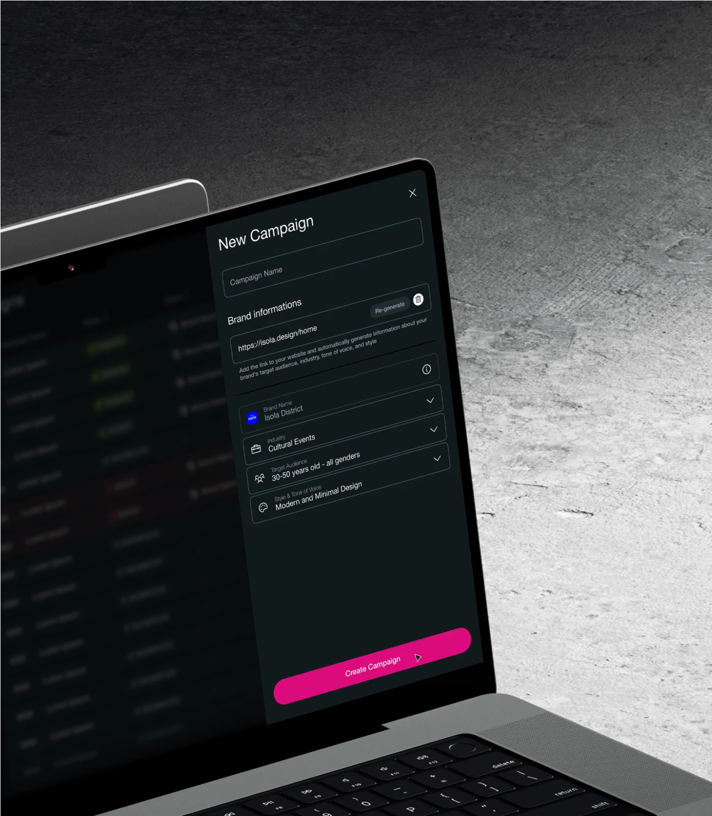
We simplified the campaign creation process to make it easier for non-proficient users. Instead of a 3-step flow, it's now just one step. When users want to create a new campaign, they click on a clear button and a side drawer opens. They can enter all the needed information there. We also suggested using AI to automatically fill in the required fields based on the company website link, making the process faster and more guided.
Initially, campaign creation and ad generation were combined, which made it confusing and hard to scale. To address this, we developed a dedicated campaign page where one or more editable ads can be automatically generated using AI. In this personalized process, users are guided step by step to help them make informed choices.


The customer's initial PoC did not include this feature, but we found it essential for developing an MVP. We added it to the ad detail view and the campaign overview to display combined performance data. This feature helped us enhance the product's value proposition by providing users with a complete end-to-end experience that encouraged them to reuse the service.

